HTML的标签都比较简单,入门非常的迅速,但是CSS是一个需要我们深度挖掘的东西,里面的很多样式属性掌握几个常用的便可以实现很好看的效果,下面我便教大家如何用CSS做一个爱心。
前期预备知识:
明白正方形的画法。
明白圆形的画法。
明白什么是定位。
明白怎么旋转。
话不多说,先教大家怎么用css画一个圆形。
.disc1{
width: 100px;
height: 100px;
border:1px solid red;
background-color: red;
margin:300px 0px 0px 300px;
border-radius:100%;
float:left;
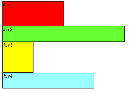
}由于我们的爱心是由两个圆和一个正方形组成的,所以我们还需要再来一个圆形。
.disc2{
    width: 100px;
    height: 100px;
    border:1px solid red;
    background-color: red;
    margin:250px 0px 0px 0px;
    border-radius:100%;
    float:left;
    position: relative;
    right: 50px;
}
第三步我们就需要做一个正方形了。
.square{
    width: 100px;
    height: 100px;
    border:1px solid red;
    background-color: red;
    margin: 300px 0px 0px 0px;
    float: left;
    position: relative;
    right: 152px;
}
做完这些的效果已经基本上出来了,但是我们还需要调整一下爱心的角度,这时就需要用到我们css样式中的transform中的rotate属性了。
我们由于需要把三个div都旋转角度,所以我们把这三个div放在一个div里面。具体代码如下:
.main{
    transform: rotate(45deg);
    margin: 300px;
}
做到现在,我们的爱心就已经做出来咯。效果图如下:

全部代码如下(包含HTML代码和CSS代码)
 1 <!DOCTYPE html>
 2 <html>
 3     <head>
 4         <meta charset="utf-8" />
 5         <link href="css/square.css" rel="stylesheet" type="text/css">
 6         <title></title>
 7     </head>
 8     <body>
 9         <div class="main">
 10             <div class="disc1"></div>
 11             <div class="disc2"></div>
 12             <div class="square"></div>
 13         </div>
 14     </body>
 15 </html>
 1 *{
 2     margin: 0px;
 3     padding: 0px;
 4 }
 5 .main{
 6     transform: rotate(45deg);
 7     margin: 300px;
 8 }
 9 .disc1{
 10     width: 100px;
 11     height: 100px;
 12     border:1px solid red;
 13     background-color: red;
 14     margin:300px 0px 0px 300px;
 15     border-radius:100%;
 16     float:left;
 17 }
 18 .disc2{
 19     width: 100px;
 20     height: 100px;
 21     border:1px solid red;
 22     background-color: red;
 23     margin:250px 0px 0px 0px;
 24     border-radius:100%;
 25     float:left;
 26     position: relative;
 27     right: 50px;
 28 }
 29 .square{
 30     width: 100px;
 31     height: 100px;
 32     border:1px solid red;
 33     background-color: red;
 34     margin: 300px 0px 0px 0px;
 35     float: left;
 36     position: relative;
 37     right: 152px;
38 } 以上就是【CSS】如何用css做一个爱心的详细内容,更多请关注php知识-学习天地 www.lxywzjs.com其它相关文章!